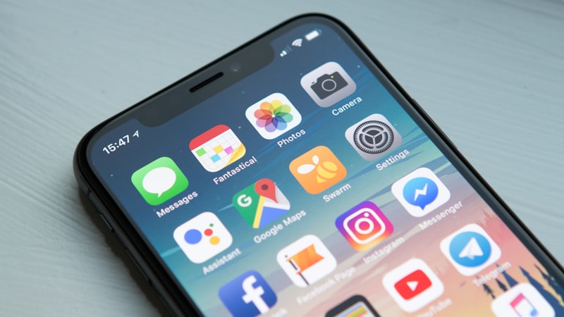
Understand why mobile-first design is crucial for UK websites and how it impacts user experience and SEO rankings.
Table of Contents
Mobile-first design is no longer optional—it's essential for UK businesses. Here's why and how to implement it effectively.
What is Mobile-First Design?
Mobile-first design is an approach where you design your website for mobile devices first, then scale up to desktop. This ensures the best possible experience for mobile users.
Why Mobile-First Design Matters
- Mobile traffic dominates: Over 60% of UK web traffic comes from mobile devices
- Google prioritises mobile: Google uses mobile-first indexing for ranking
- Better user experience: Mobile-first design improves usability
- Higher conversions: Mobile-friendly sites convert better
Key Principles of Mobile-First Design
1. Simplify Navigation
Use hamburger menus, clear icons, and logical navigation structures that work well on small screens.
2. Touch-Friendly Elements
Buttons and links should be large enough to tap easily (minimum 44x44 pixels).
3. Optimise Images
Use responsive images that load quickly on mobile devices without sacrificing quality.
4. Readable Typography
Use font sizes that are readable on small screens (minimum 16px for body text).
5. Fast Loading Speeds
Mobile users expect fast loading times. Optimise your site for speed.
Conclusion
Mobile-first design is essential for UK businesses. Contact us to learn how we can help you implement a mobile-first strategy.